
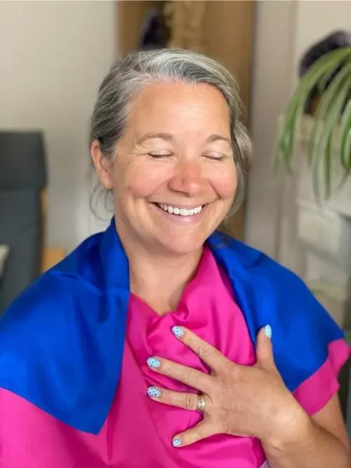
Nicky, Winter palette
Feeling Colours Session as a Lens and a Compassionate Mirror for Personal Development
(Published with full permission)
Nicky is a public speaker and life coach who came for her Feeling Colours session in August 2025. She had been wanting to experience colour analysis for years — and was excited to discover her colours the feeling way.
We began as I always do: with an invitation to pick an oracle card from the Osho Zen Tarot deck — a deck I first encountered at a healing retreat in Thailand in 2001, and which has held deep resonance for me ever since.
Not one but three cards jumped out: Adventure, The Burden, and Fighting. Together, they hinted at a desire to move forward in the world with full trust — countered by unconscious beliefs holding her back, and an internal conflict quietly simmering beneath the surface.
Standing on a Precipice
We dived into the process of feeling the colours, with Nicky seated, eyes closed, as I guided her through each one.
A clear pattern emerged. The Summer colours — cool and soft — represented her past. Draped in them, she looked bland, dull. She felt irritated. The Winter colours, by contrast, were her future. She looked bright, lit up, unmistakably herself.
And yet she stood on a precipice, not quite ready to step forward.
Visually, Winter was without question her season. She looked vibrant, present, available, and in her power — eyes sparkling, someone to step towards. But several of the colours felt occupied. They carried an overlay of story, of belief, of someone else’s energy. In this case: ancestral wounding.
The Pink Revelation
Nicky’s absolute favourite colour — and her business brand colour — is pink. So it came as a surprise to us both when pink felt bad on her. She didn’t want it anywhere near her.
Through gentle questions, something began to surface: a crossed wire between women and power. A block to stepping in and claiming her own.
Then Nicky, drawing on her life coaching vocabulary, suddenly lit up: “Identity shift!”
Yes. That was exactly it — the name for the feeling of standing on a precipice. Moving beyond a self-concept we have outgrown, but into what? Into whom? It’s a profound step into the unknown, and not one within our conscious control. The hesitation made complete sense.
We paused for refreshments and integration. Then I invited Nicky to pick another card.
She drew The Fool.
Just as she had been standing on a precipice between Past and Future, The Fool stands at the cliff edge — ready to step off in total trust that life will hold him. It was a perfect reflection of the dichotomy between her Summer and Winter colours, and a clear invitation to step into the new identity of empowered woman.
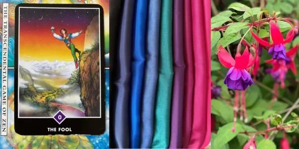
The Subtle Shift of Pinks
What happened next illustrated just how precise — and profound — this work can be.
We found Nicky’s pink. It was Hot Pink. The difference in tone from the pink that had felt wrong was almost imperceptible to the eye. And yet the versions of Nicky who showed up in each were worlds apart.
Mid-Pink: “This feels very familiar — but it’s the past me, not who I’m moving towards. I’m ready to say goodbye. I don’t think this is who I want to continue being. This is a past colour.” She wanted to slouch. She felt it connect to her diaphragm — the site of the solar plexus, the power centre — in a pushing, effortful, yang way.
Hot Pink (Fuchsia): “I’m ready to move forward.” Boldness. Courage. Strength. She sat up straighter. She felt it connect to her sacral chakra, her heart, her third eye.
This Winter pink created a completely different energetic structure — linking the power centres of gut, heart, and intuition into an authentic, aligned expression of who she is. Full body alignment. Roots and wings. A connection to higher wisdom.
This was Nicky in her power.
After a brief moment of nervousness at the unfamiliarity of the sensation, she stepped in — committed: “I’m ready to move forward.”
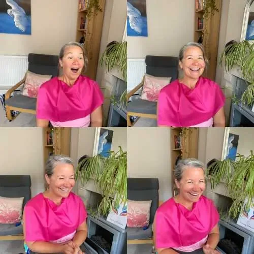
More Superpower Colours
Nicky discovered more allies in the Winter palette that activate her superpowers:
Silver — majestic, powerful, uplifted
Black — feels like home; stillness; mind emptied out; quiet, calm strength; networking
Royal Blue — strong, powerful woman; leadership, teaching, speaking on stage
Charcoal — safe to open up; the nervous system can soften and settle
Hot Pink + Royal Blue — the idea colour combination for speaking on stage
Parting Words
Nicky left with a smile on her face and her Winter Colour Pass in hand.
“This has really got me questioning my thought process around stuff. I haven’t had a situation to do that with for a while — I’ve been so used to coaching and mind management. It has been really fascinating. I’ve really enjoyed it.”
A Year On…
After the session, Nicky filtered out around 80% of her wardrobe, passing clothes on to friends and charity shops.
Almost a year later, Nicky is often seen wearing black, and royal blue features frequently too. Her website has had a face lift and pink has taken a back seat, with black leading.
“This process, still a year later, is blowing my mind. It makes my shopping so much easier. I have my Winter Colour Pass permanently in my bag and I don’t buy anything unless it matches the colour.
“I just love the fact that I have a colour for presenting – Royal Blue; a colour for hosting or facilitating workshops, which is my Fuchsia Pink; and then for networking and meeting people and just being out and about, it’s the Black which I just spend most of my time in and I absolutely love.
“It was such a fascinating journey going through this with Alison that I would highly recommend anyone to do it. The energetics of colour, taking your mind out of it, was just fascinating. Meeting that on a deeper level was incredible.”
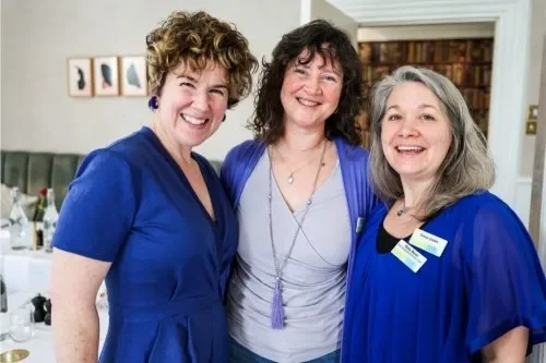
Winter – Summer – Winter sandwich. Photo by Em Wilkinson
With thanks to Nicky for her openness in sharing the details of her experience.
Nicky Bevan – Public Speaker, Emotional Resilience Trainer, group/team coaching, 1:1 coach